April May Be the Cruelest, But January Is the Strangest Month
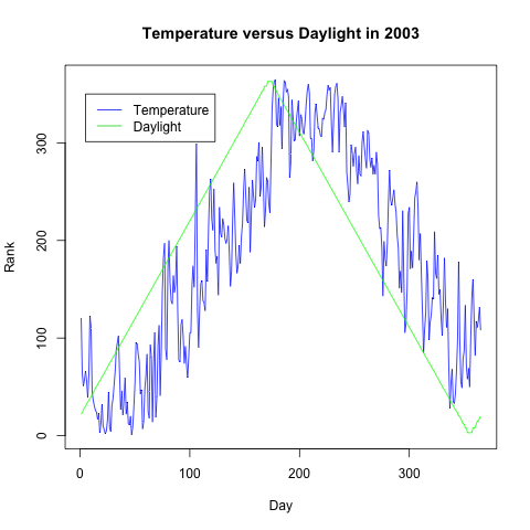
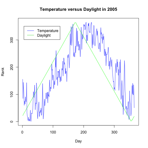
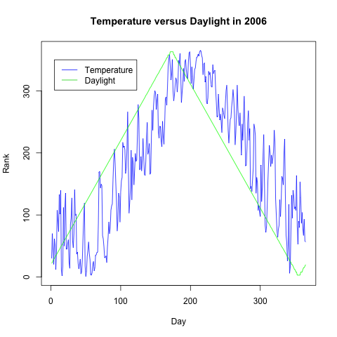
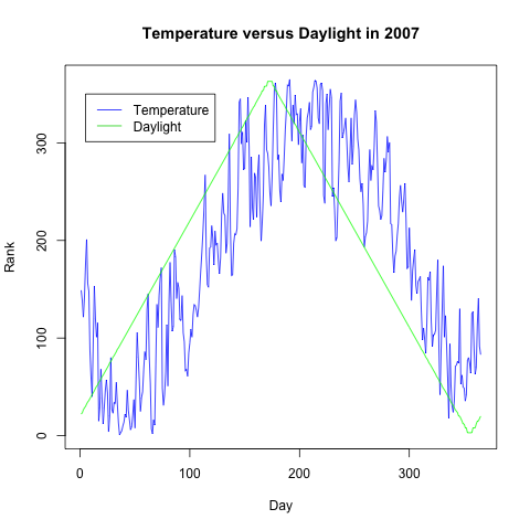
I always find January a strange month, because the weather tends to get colder over the course of the month, even though the days get progressively longer. Given that I had already scrounged up data on the temperature in New York City a while back, I thought I should plot a graph showing the strange disconnect between day length and temperature that characterizes January. I was able to find an Excel spreadsheet that calculated the number of hours of daylight New York City received each day of the year; I used my previous weather data for the average temperatures for each day in 2003, 2005, 2006 and 2007. For the three data points for which I had no temperatures – 1/13/2003, 3/1/2003 and 8/28/2007 -, I used linear interpolation to estimate that day’s average temperature. I skipped 2004 in my analysis because it was a leap year.
The graphs below make clear – some moreso than others – that January is a distinctive month, because the mean temperature noticeably lags behind the mean length of the day. You can also see a similar pattern for the temperatures in July, which are warmer than June’s temperatures even though the days are already getting shorter. Both of these imply that it is not the mere presence of sunlight that determines the temperature each day, but rather the accumulated warmth due to the sunlight of the previous month.
To be clear about the construction of the graphs and their interpretation, the rank of a data point is its relative position in the order of the entire data set. The warmest day in a year is ranked 365 and the coldest day is ranked 1; similarly, the longest day in a year is ranked 365 and the shortest day is ranked 1. Day 1 is January 1st; day 365 is December 31st.