Color Schemes for R Bar Plots
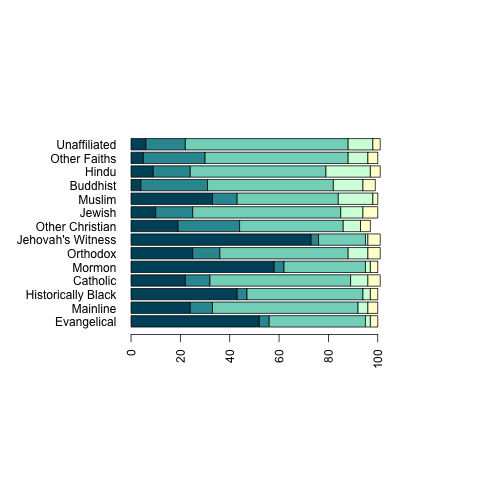
A recurrent source of irritation for me is the absence of a good default behavior in R for choosing the color scheme for bar plots. A stacked bar plot looks only as good as the color scheme you use. In hope of finding a usable scheme that I could settle on as a personal default, I picked two color schemes, Sunshine over Glacier and Sweet Valentine, from Adobe’s Kuler site that struck me as particularly nice for bar plots. To test them, I plotted data from a recent Gene Expression post on moral beliefs among different religious groups in America. You can see the results below.
Sunshine over Glacier
Sweet Valentine
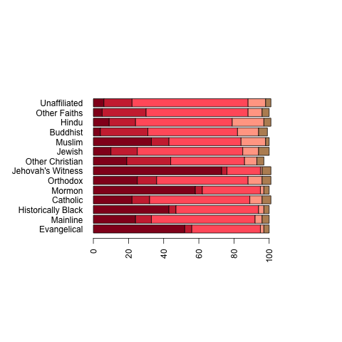
What do people think of these color schemes? Also, does anyone have ideas about how to incorporate a legend that doesn’t ruin the balance of this plot? At present, it’s impossible to know what these graphs actually mean, but I haven’t been able to figure out how to add a legend to the graphs without substantially expanding the screen area used by them.