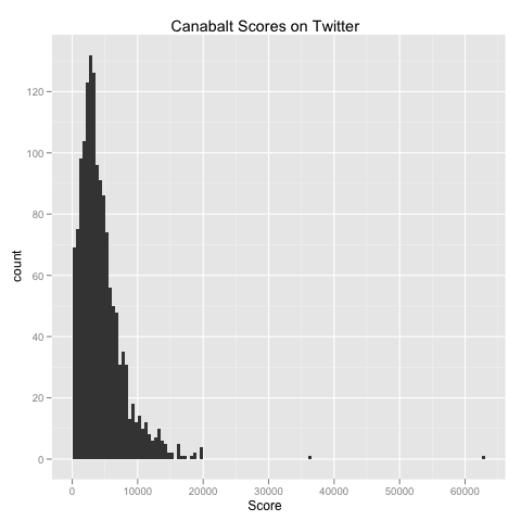
At the office today, I got into a discussion with two of my fellow graduate students about the distribution of scores you can get while playing Canabalt. Because (1) the layout of the levels in the game is fully randomized and (2) the difficulty of certain actions (specifically jumping through windows) is exceptionally high, we were intrigued by the possibility that a fully random model of scores, which completely ignores player-specific skill levels, could account for the distribution of scores you see in the real world.
While thinking about this on my way home from Rockville tonight, I decided that I should write a simple web spider to parse the notices on Twitter that Canabalt automatically generates. Thankfully, other people had already done just this, so I discovered quickly that you only need to search for www.canabalt.com on Twitter to get the relevant information. After spidering the results of this search query, I constructed the following histogram of scores posted recently to Twitter using Hadley Wickham’s ggplot2 package for R. Here’s the results:
While generating this plot, a question I had asked several other R users about a few months ago came up again: is there no way to get the Y axis label to be anything other than “count” when you generate a histogram? The qplot simply ignores any ylab argument you pass in, so I suspect that the answer is “yes, you simply cannot change this default without hacking the ggplot2 source code.”
Sometime this weekend I plan to follow this short piece up with a longer post containing more substantial statistical analyses of this data. If you’ve got interesting ideas for analyses, let me know.