Twifficiency Scores
Neil Kodner wrote a great post this morning about yesterday’s Twifficiency scores outbreak. He grabbed all the auto-tweeted scores he could find and plotted their distribution. I was struck by the asymmetry of the resulting distribution, which you can see below:
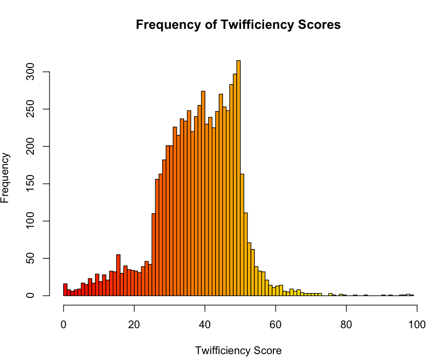
Thankfully, Neil handed me the raw data for his plot, so I was able to run a K-S test for normality, which rejected normality pretty easily, though I’m coming up with a tie that I’m surprised by:
scores <- read.csv('twifficiencyscores.txt', header = FALSE)
scores <- scores[,1]

m <- mean(scores)
s <- sd(scores)

ks.test(scores, 'pnorm', m, s)
#
#	One-sample Kolmogorov-Smirnov test
#
#data:  scores
#D = 0.0616, p-value < 2.2e-16
#alternative hypothesis: two-sided
#
#Warning message:
#In ks.test(scores, "pnorm", m, s) :
#  cannot compute correct p-values with ties
I suppose that I’m a bit worried that the p-value is simply a reflection of sample size here, since there are 7089 measurements. Would it be more compelling to bootstrap the D score from the K-S test on samples of 500 scores at a time to confirm that the non-normality is present even in small groups of scores?
Assuming that the data really has a skewed distribution, does anyone understand the scoring system well enough to say what produces the asymmetry?