Introduction
Continuing on with my series on the weaknesses of NHST, I’d like to focus on an issue that’s not specific to NHST, but rather one that’s relevant to all quantitative analysis: the destruction caused by an inappropriate reduction of dimensionality. In our case, we’ll be concerned with the loss of essential information caused by the reduction of a two-dimensional world of uncertain measurements into the one-dimensional world of p-values.
p-Values Mix Up the Strength of Effects with the Precision of Their Measurement
For NHST, the two independent dimensions of measurement are (1) the strength of an effect, measured using the distance of a point estimate from zero; and (2) the uncertainty we have about the effect’s true strength, measured using something like the expected variance of our measurement device. These two dimensions are reduced into a single p-value in a way that discards much of the meaning of the original data.
When using confidence intervals, the two dimensions I’ve described are equivalent to the position of the center of the confidence interval relative to zero and the width of the confidence interval. Clearly these two dimensions can vary independently. Working through the math, it is easy to show that p-values are simply a one-dimensional representation of these two dimensions.1
To illustrate how many different kinds of data sets receive the same p-value under NHST, let’s consider three very different data sets in which we test for a difference across two groups and then get the same p-value out of our analysis:

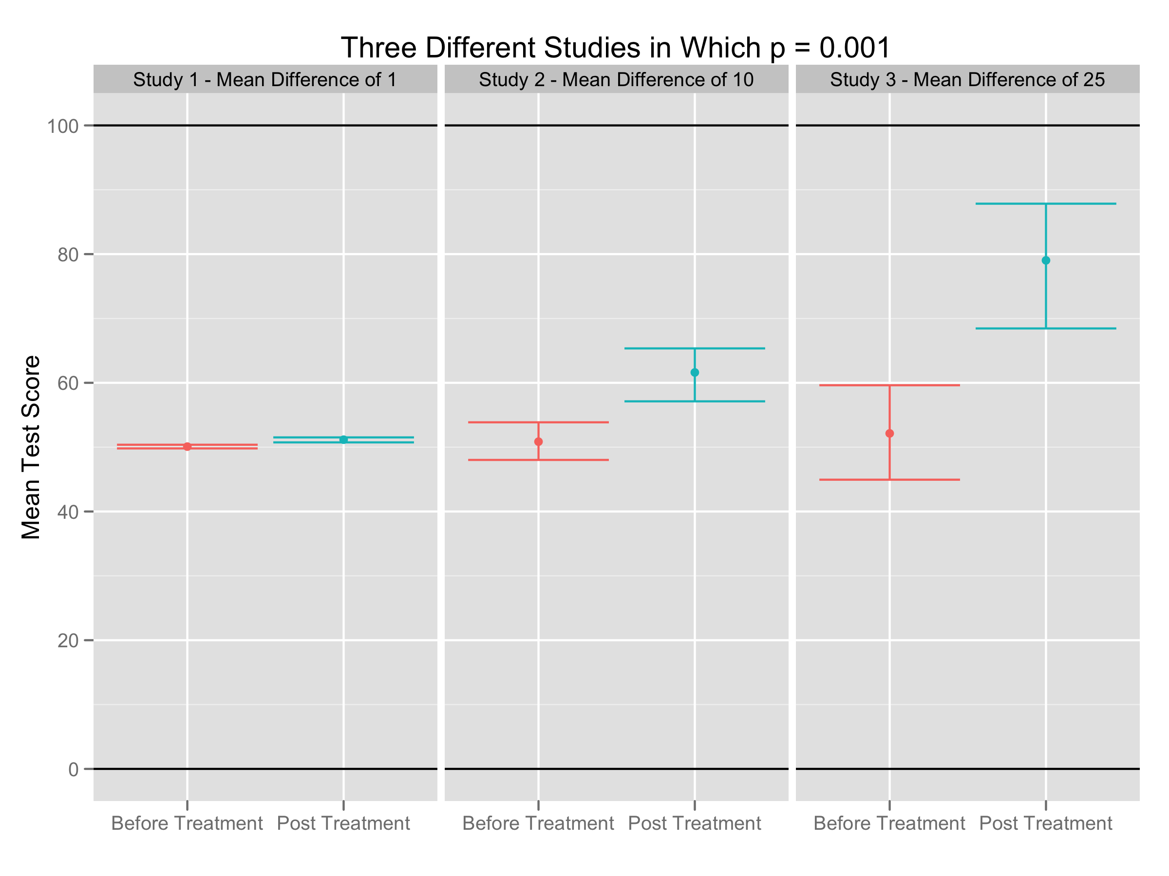
Clearly these data sets are substantively different, despite producing identical p-values. Really, we’ve seen three qualitatively different types of effects under study:
- An effect that is probably trivial, but which has been measured with considerable precision.
- An effect with moderate importance that has been measured moderately well.
- An effect that could be quite important, but which has been measured fairly poorly.
No one can argue that these situations are not objectively different. Importantly, I think many of us also feel that the scientific merits of these three types of research are very different: we have some use for the last two types of studies and no real use for the first. Sadly, I suspect that the scientific literature increasingly focuses on the first category, because it is always possible to measure anything precisely if you are willing to invest enough time and money. If the community’s metric for scientific quality is a p-value, which can be no more than a statement about the precision of measurements, then you will find that scientists produce precise measurements of banalities rather than tentative measurements of important effects.
How Do We Solve This Problem?
Unlike previous posts, this problem with the use of NHST can be solved without any great effort to teach people to use better methods: to compute a p-value, you need to estimate both the strength of an effect and the precision of its measurement. Moving forward, we must be certain that we report both of these quantities instead of the one-number p-value summary.
Sadly, people have been arguing for this change for years without much success. To solve our impasse, I think we need to push on our community to impose a flat out ban: going forward, researchers should only be allowed to report confidence intervals. Given that p-values can always be derived from the more informative confidence intervals while the opposite transformation is not possible, how compelling could any argument be for continuing to tolerate p-values?
References
Ziliak, S.T. and McCloskey, D.N. (2008), “The cult of statistical significance: How the standard error costs us jobs, justice, and lives”, Univ of Michigan Press
- Indeed, p-values are effectively constructed by dividing the distance of the point estimate from zero by the width of the confidence interval and then passing this normalized distance through a non-linear function. I’m particularly bewildered by the use of this non-linear function: most people have trouble interpreting numbers already, and this transformation seems almost designed to make the numbers harder to interpret.↩
You do a great job showing that the three examples above are different, despite identical p-values, with your chart construction. But, if one wanted to make the counter-argument, it would be easy to lie with charts if you generated the three charts independently, and had your software scale the Y-axis for you.
The resulting charts will look pretty much identical, but for those pesky axis labels that nobody really ever looks at.
That’s true. Thankfully, I didn’t do that.
Hi John,
Thanks for the series of posts. I would like to point out two things:
1. The status quo on reporting results seems to vary greatly across disciplines; for example, in my area reporting only p-values is not accepted in most journals.
2. I think the difference between the graphs can be also occur to the underlying variability of the traits under study. Thus, if we are measuring the length of wooden boards (cut using different tools so we have an effect) by eye, using a measuring tape and using a laser we’ll probably observe something like your graph. However, if we were measuring something like tree heights in a forest (even with the lasers) versus seedling heights we would also observe that type of difference.
Hi Luis,
1. In our field reporting only p-values is sometimes accepted and sometimes not accepted. But I actually think that the mere presence of a p-value is troubling, because it provides the seductive possibility of ignoring a confidence interval and getting a single number back.
2. You’re right that the graphs can occur either because of the variability in the traits under study or because of the sample sizes used: the variance of the estimated mean is the result of dividing the variability of the traits by the sample size. I’ve ignored that issue here by not reporting either the variability of the sample size: neither of which seems to matter when we really care about the difference in means before and after treatment.
I’m confused by the way you’re discussing this, John. The three panels depict roughly similar standardized effect sizes, and I’d argue that this is exactly what we’re interested in when studying to what degree a treatment influences group performance. As the comment above said, we can make the apparent difference disappear by scaling our measures differently.
You say:
“I’ve ignored that issue here by not reporting either the variability of [sic?..] the sample size: neither of which seems to matter when we really care about the difference in means before and after treatment.”
In fact we do care a great deal about the variability when dealing with changes in *group* means before and after treatment. The within-group variability is not due (only) to the imprecision of the instrument, it is due to actual variability in true scores. In order to judge how meaningful change is, we need to know how much the mean has moved relative to the underlying variability in the population. The scale of the numbers is only meaningful in terms of the variation in the population. If 99% of people taking this test score between a 50.0-50.5, it is a very big deal to have a mean change of 1.
My understanding is that p-values do indeed make a single dimension out of two, but the two dimensions are N and standardized effect size (change relative to sample variability – e.g., Pearson’s r or Cohen’s d, etc).
Zebrafish, actually, there’s no way at all to estimate the standardized effect sizes from the graphs presented. I don’t know how you can make that claim. I took it that the implicit assumption is that the variance of the scores is roughly the same in each case, mostly because the implication is that each test measures the exact same kind of thing and the variance is inherent in that thing.
Your comment could be taken as something that might be clarified in an edit of this blog post though. Simply adding in that assumption would suffice.
Hi Zebrafish and John,
Thanks for the questions and internal discussion with each other. Let me throw in my own views, so that we can see how this post could be edited when I compile all of the separate posts into a single whole. I suspect that my response won’t be totally fulfilling to you, Zebrafish; partially because I don’t like effect sizes very much and partially because the thinking in my response is still a little vague.
I’ll start by taking an admittedly controversial stance: effect sizes are not a good metric of the things we should want to measure, because, like p-values, they collapse two dimensions (mean and variance) into one dimension. There is, as you point out, yet another dimension, N, that affects a p-value, but that is a known constant and therefore not something we need to infer from our data nor grapple with epistemologically. Our only goal is to measure the difference in means between the two groups while keeping track of our uncertainty about that measurement — and we need to keep those things separate at all times. The variance of data within a group, directly related to the variance of the mean of a group by dividing out by N, is simply a source of noise that affects our measurements of that difference in means — it has no influence at all over the true difference in means. My source of frustration with NHST is that p-values combine our estimate of the difference in means with the precision of this estimate — but, we should often only care about the first dimension when making a decision about performing this treatment in the future. Yes, we should care about the certainty of this knowledge when we make a decision, but, assuming that our entire knowledge of the means before and after treatment is shown in these graphs, there is no difference in relative uncertainty between the two groups. In short, the second dimension of substance (the precision of our measurements) is perfectly matched across all groups and should not be relevant to real-world decisions. Under traditional EU-based decision theory, we should perform the treatment when the expected difference in means offsets a factor we haven’t discussed so far: the real world costs of the treatment. Calculations involving that variable are importantly different in all three of these cases, even though, assuming that N is equal in all three slots, p-values and effect sizes for these examples would be identical — with a proviso that effect size is calculated as mean / variance rather than mean / sqrt(variance). In short, effect sizes deny information that we must possess to use decision theory, which I feel is the proper way to conceptualize how we ought to react to the inferences we make from data. The effect size metric, just like the p-value, collapses across two independent dimensions — which is a grave mistake when, as in my hypothetical example, only the first of those dimensions has any bearing on the decisions we should make based on data. These data sets are aliased in p-value space and in effect size space, but they are importantly different in decision theory space and importantly different in their effects on real human lives.
Is not the graph just showing the fact that a p value is basically effect size x sample size, so if you increase sample size but keep effect size constant the p value gets smaller etc. See: Rosnow R L, Rosenthal R 2003 Effect Sizes for experimenting psychologists. Canadian journal of experimental psychology (57) 221- 237
For some other references see: http://www.robin-beaumont.co.uk/virtualclassroom/stats/basics/part15_power.pdf
There are also here issues about the underlying distribution of the P value which changes shape dependent upon the specific alternative distribution, interestingly when the null is true the distribution is uniform but as the effect size increases the distribution becomes more skewed toward the significant end. There are also issues regrading the ‘reproducibility’ of the p value taking this underlying distribution issue into account. Several people have tried to develop VP values to try and help with this problem see understanding the new statistics by geoff cumming 2012
Hi Robin,
The graph could be showing the change you’re describing, in which sample size goes up. But it could also be showing data with different variances, but a constant effect size. A p-value depends on three things: the size of the difference in means, the variance of the individual data points and the number of observed data points. I’ve left the variance and number of data points unspecified intentionally, because I wanted to hammer home the fact that the difference in mean could vary considerably and still produce the same value. For practical decisions, the most important thing is the difference in means and not the variance of the data or the sample size. p-values discard that most important factor and focus on the precision of the measurement of the difference in means.
I think your take home point (as I understand it) is a good one. The value of a result cannot be know by simply looking at the p-value, and too often, what is being demonstrated by the degree of significance is misunderstood. As long as the interpreter keeps in mind the three things the p-value is based on (you mention them above), and what those things in combination with the p-value are actually telling you about the data being analyzed, misunderstandings will be avoided.