One Paragraph Summary Link to heading
Always explore your data visually. Whatever specific hypothesis you have when you go out to collect data is likely to be worse than any of the hypotheses you’ll form after looking at just a few simple visualizations of that data. The most effective hypothesis testing framework in existence is the test of intraocular trauma.
Context Link to heading
This morning, I woke up to find that Neil Kodner had discovered a very convenient CSV file that contains geospatial data about every valid US zip code. I’ve been interested in the relationship between places and zip codes recently, because I spent my summer living in the 98122 zip code after having spent my entire life living in places with zip codes below 20000. Because of the huge gulf between my Seattle zip code and my zip codes on the East Coast, I’ve on-and-off wondered if the zip codes were originally assigned in terms of the seniority of states. Specifically, the original thirteen colonies seem to have some of the lowest zip codes, while the newer states had some of the highest zip codes.
While I could presumably find this information through a few web searches or could gather the right data set to test my idea formally, I decided to blindly plot the zip code data instead. I think the results help to show why a few well-chosen visualizations can be so much more valuable than regression coefficients. Below I’ve posted the code I used to explore the zip code data in the exact order of the plots I produced. I’ll let the resulting pictures tell the rest of the story.
zipcodes <- read.csv("zipcodes.csv")
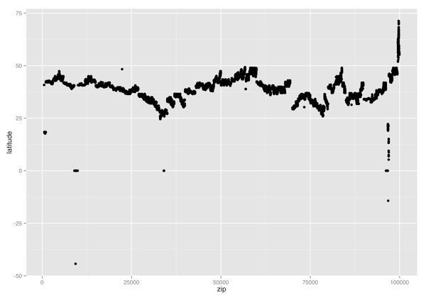
ggplot(zipcodes, aes(x = zip, y = latitude)) +
geom_point()
ggsave("latitude_vs_zip.png", height = 7, width = 10)
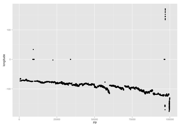
ggplot(zipcodes, aes(x = zip, y = longitude)) +
geom_point()
ggsave("longitude_vs_zip.png", height = 7, width = 10)
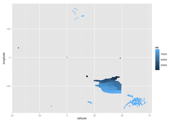
ggplot(zipcodes, aes(x = latitude, y = longitude, color = zip)) +
geom_point()
ggsave("latitude_vs_longitude_color.png", height = 7, width = 10)
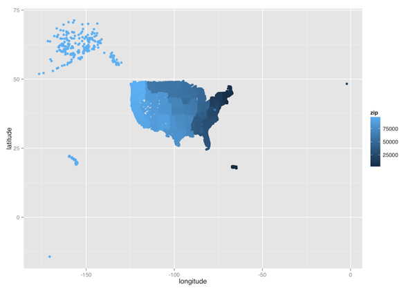
ggplot(zipcodes, aes(x = longitude, y = latitude, color = zip)) +
geom_point()
ggsave("longitude_vs_latitude_color.png", height = 7, width = 10)
ggplot(
subset(zipcodes, longitude < 0),
aes(x = longitude, y = latitude, color = zip)
) +
geom_point()
ggsave("usa_color.png", height = 7, width = 10)
Picture Link to heading
(Latitude, Zipcode) Scatterplot
(Longitude, Zipcode) Scatterplot
(Latitude, Longitude) Heatmap
(Longitude, Latitude) Heatmap

(Longitude, Latitude) Heatmap without Non-States