The Big Message Link to heading
People sometimes use \(R^2\) as their preferred measure of model fit. Unlike quantities such as MSE or MAD, \(R^2\) is not a function only of model’s errors, its definition contains an implicit model comparison between the model being analyzed and the constant model that uses only the observed mean to make predictions. As such, \(R^2\) answers the question: “does my model perform better than a constant model?” But we often would like to answer a very different question: “does my model perform worse than the true model?”
In theoretical examples, it is easy to see that the answers to these two questions are not interchangeable. We can construct examples in which our model performs no better than a constant model, even though it also performs no worse than the true model. But we can also construct examples in which our model performs much better than a constant model, even when it also performs much worse than the true model.
As with all model comparisons, \(R^2\) is a function not only of the models being compared, but also a function of the data set being used to perform the comparison. For almost all models, there exist data sets that are wholly incapable of distinguishing between the constant model and the true model. In particular, when using a dataset with insufficient model-discriminating power, \(R^2\) can be pushed arbitrarily close to zero – even when we are measuring \(R^2\) for the true model. As such, we must always keep in mind that \(R^2\) does not tell us whether our model is a good approximation to the true model: \(R^2\) only tells us whether our model performs noticeably better than the constant model on our dataset.
A Theoretical Example Link to heading
To see how comparing a proposed model with a constant model could lead to opposite conclusions than comparing the same proposed model with the true model, let’s consider a simple example: we want to model the function \(f(x)\), which is observed noisily over an equally spaced grid of \(n\) points between \(x_{min}\) and \(x_{max}\).
To start, let’s assume that:
- \(f(x) = \log(x)\).
- \(x_{min} = 0.99\).
- \(x_{max} = 1.01\).
- At 1,000 evenly spaced values of \(x\) between \(x_{min}\) and \(x_{max}\), we observe \(y_i = f(x_i) + \epsilon_i\), where \(\epsilon_i \sim \mathbf{N}(0, \sigma^2)\).
Based on this data, we’ll attempt to learn a model of \(f(x)\) using univariate OLS regression. We’ll fit both a linear model and a quadratic model. An example realization of this modeling process looks like the following:
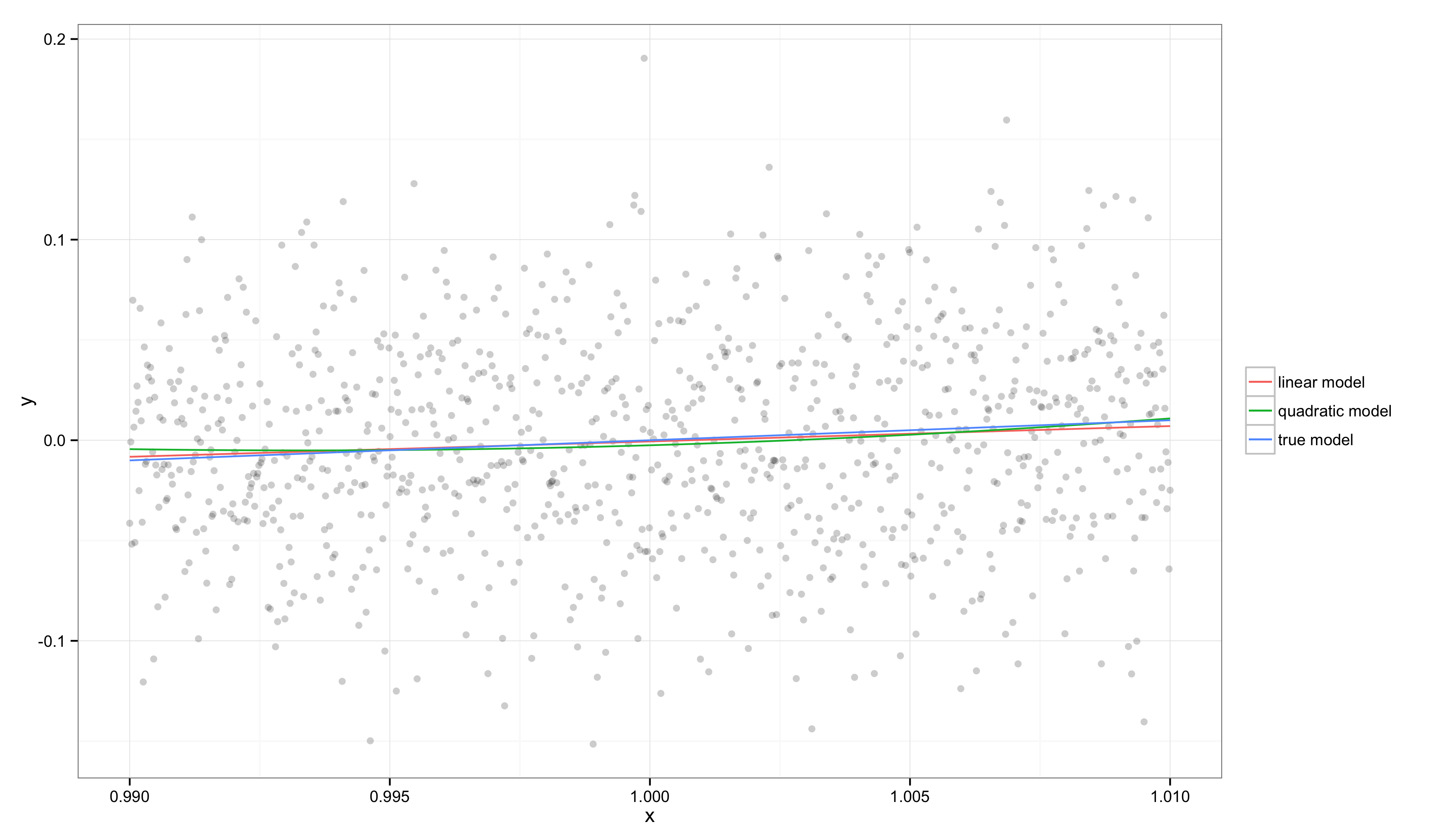
In this graph, we can see that \(f(x)\) is well approximated by a line and so both our linear and quadratic regression models come close to recovering the true model. This is because \(x_{min}\) and \(x_{max}\) are very close and our target function is well approximated by a line in this region, especially relative to the amount of noise in our observations.
We can see the quality of these simple regression models if we look at two binary comparisons: our model versus the constant model and our model versus the true logarithmic model. To simplify these calculations, we’ll work with an alternative \(R^2\) calculation that ignores corrections for the number of regressors in a model. Thus, we’ll compute \(R^2\) for a model \(m\) (versus the constant model \(c\)) as follows:
$$ \begin{align*} R^2 &= \frac{\text{MSE}_c - \text{MSE}_m}{\text{MSE}_c} \\ &= 1 - \frac{\text{MSE}_m}{\text{MSE}_c} \\ \end{align*} $$As with the official definition \(R^2\), this quantity tells us how much of the residual errors left over by the constant model are accounted for by our model. To see how this comparison leads to different conclusions than a comparison against the true model, we’ll also consider a variant of \(R^2\) that we’ll call \(E^2\) to emphasize that it measures how much worse the errors are than we’d see using the true model \(t\):
$$ \begin{align*} E^2 &= \frac{\text{MSE}_m - \text{MSE}_t}{\text{MSE}_t} \\ &= \frac{\text{MSE}_m}{\text{MSE}_t} - 1 \\ \end{align*} $$Note that \(E^2\) has the opposite sense as \(R^2\): better fitting models have lower values of \(E^2\).
Computing these numbers on our example, we find that \(R^2 = 0.007\) for the linear model and \(R^2 = 0.006\) for the true model. In contrast, \(E^2 = -0.0008\) for the linear model, indicating that it is essentially indistinguishable from the true model on this data set. Even though \(R^2\) suggests our model is not very good, \(E^2\) tells us that our model is close to perfect over the range of \(x\).
Now what would happen if the gap between \(x_{max}\) and \(x_{min}\) grew larger? For a monotonic function like \(f(x) = \log(x)\), we’ll see that \(E^2\) will constantly increase, but that \(R^2\) will do something very strange: it will increase for a while and then start to decrease.
Before considering this idea in general, let’s look at one more specific example in which \(x_{min} = 1\) and \(x_{max} = 1000\):
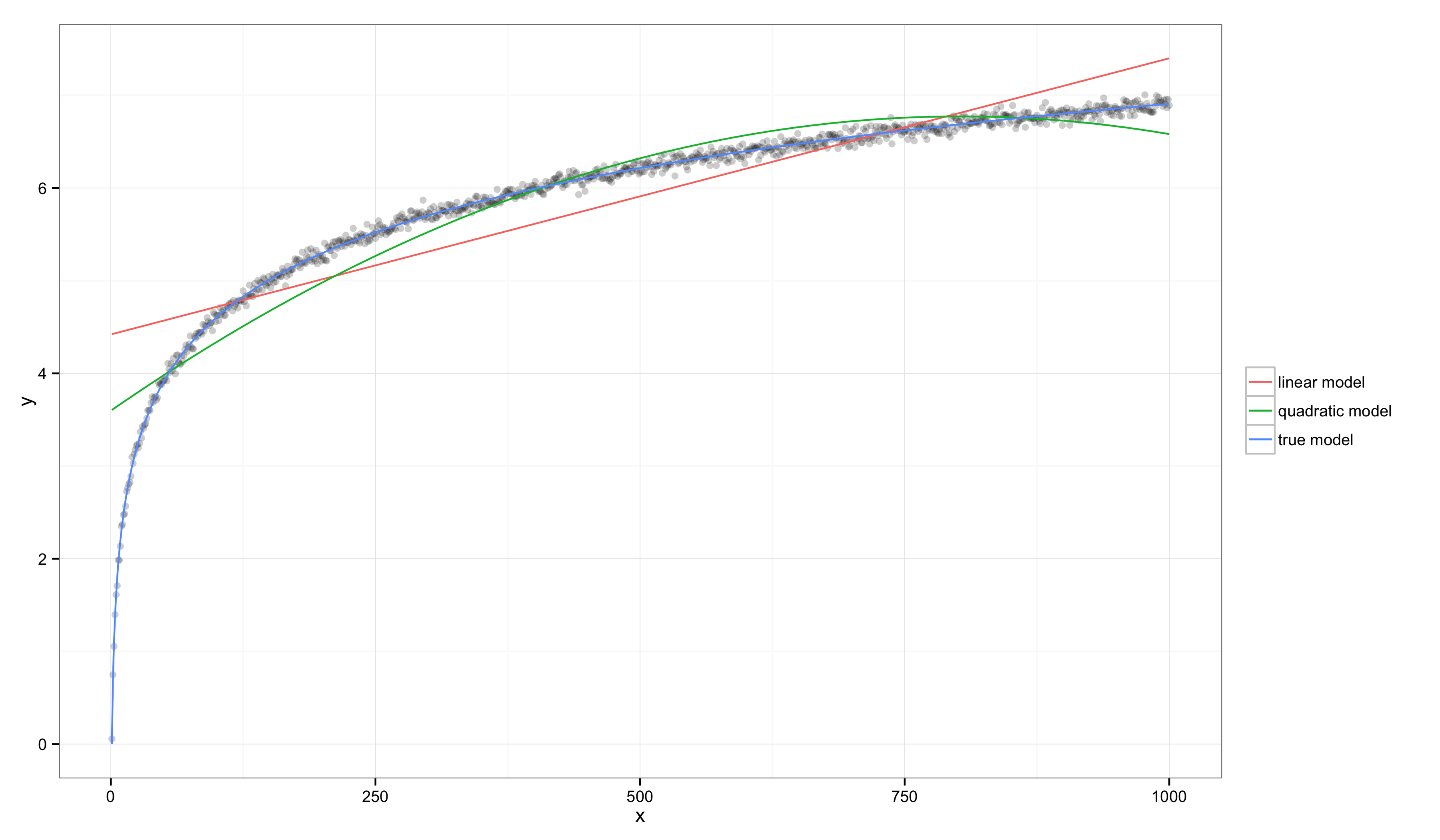
In this case, visual inspection makes it clear that the linear model and quadratic models are both systematically inaccurate, but their values of \(R^2\) have gone up substantially: \(R^2 = 0.760\) for the linear model and \(R^2 = 0.997\) for the true model. In contrast, \(E^2 = 85.582\) for the linear model, indicating that this data set provides substantial evidence that the linear model is worse than the true model.
These examples show how the linear model’s \(R^2\) can increase substantially, even though most people would agree that the linear model is becoming an increasingly unacceptably bad approximation of the true model. Indeed, although \(R^2\) seems to improve when transitioning from one example to the other, \(E^2\) gets strictly worse as the gap between \(x_{min}\) and \(x_{max}\) increases. This suggests that \(R^2\) might be misleading if we interpret it as a proxy for the generally unmeasurable \(E^2\). But, in truth, our two extreme examples don’t tell the full story: \(R^2\) actually changes non-monotonically as we transition between the two cases we’ve examined.
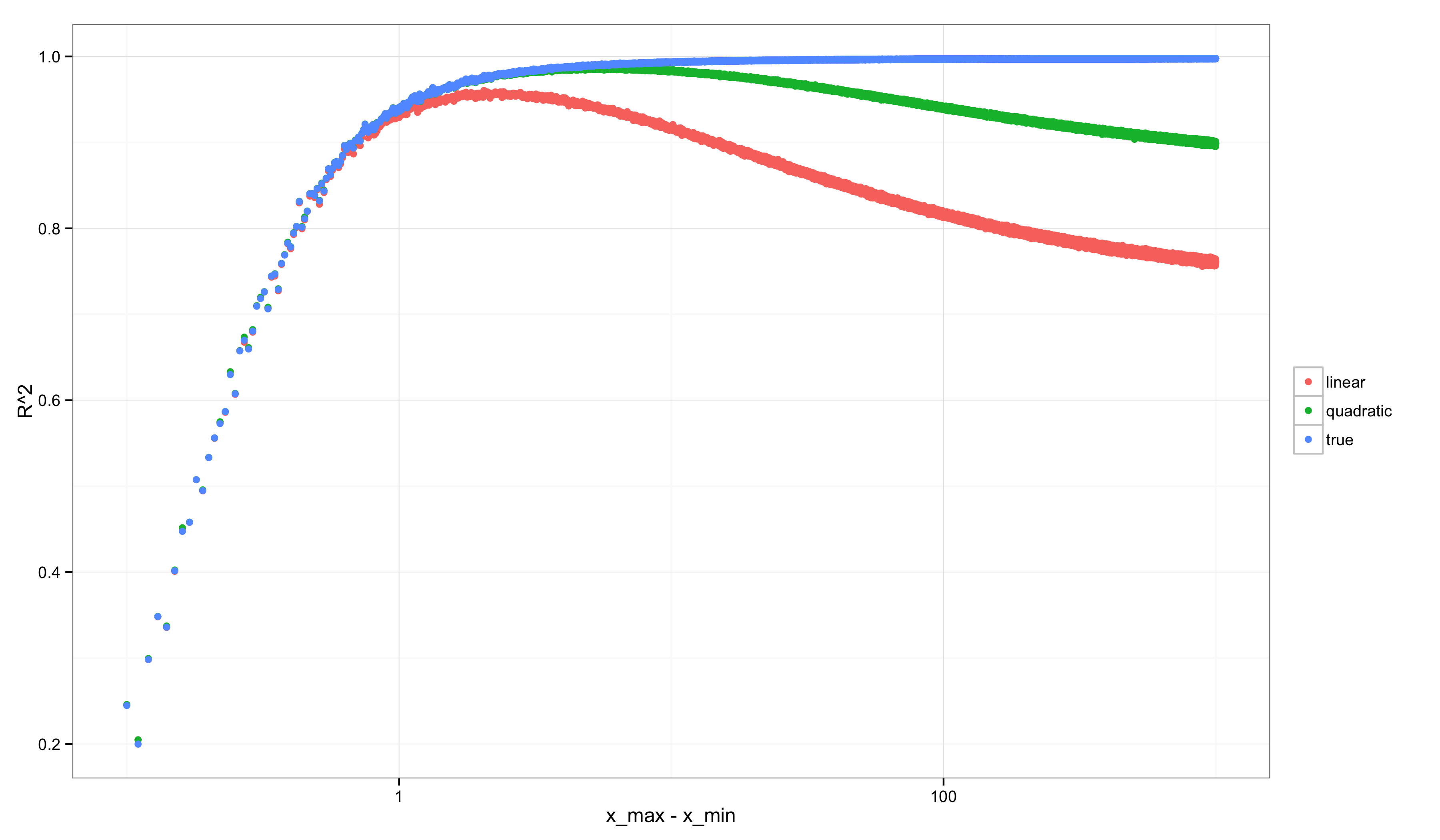
Consider performing a similar analysis to the ones we’ve done above, but over many possible grids of points starting with \((x_{min}, x_{max}) = (1, 1.1)\) and ending with \((x_{min}, x_{max}) = (1, 1000)\). If we calculate \(R^2\) and \(E^2\) along the way, we get graphs like the following (after scaling the x-axis logarithmically to make the non-monotonicity more visually apparent).
First, \(R^2\):
Second, \(E^2\):
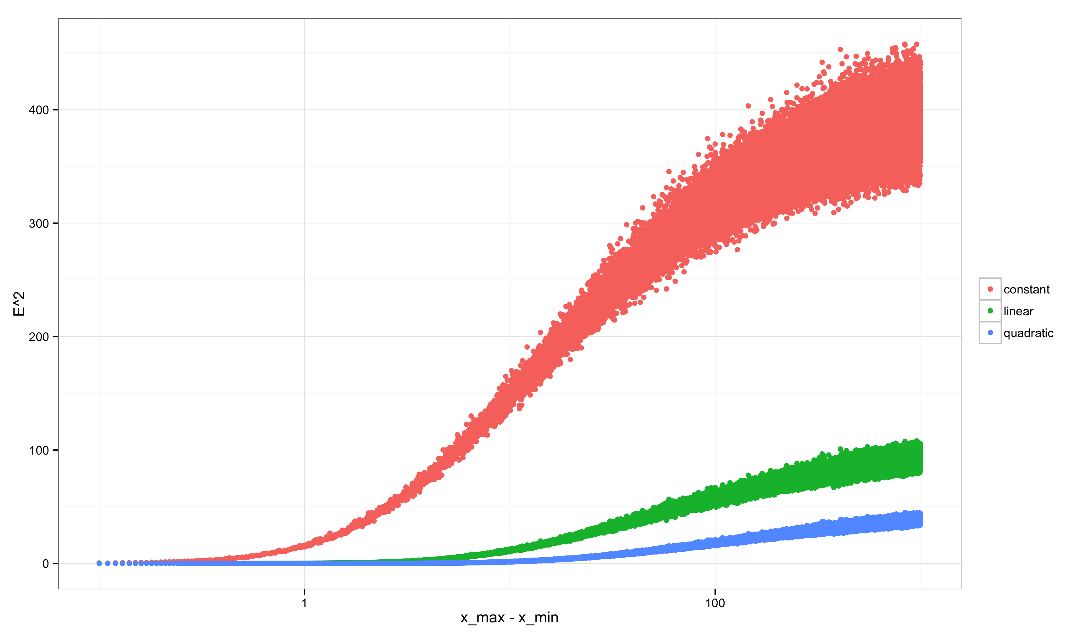
Notice how strange the graph for \(R^2\) looks compared with the graph for \(E^2\). \(E^2\) always grows: as we consider more discriminative data sets, we find increasingly strong evidence that our linear approximation is not the true model. In contrast, \(R^2\) starts off very low (precisely when \(E^2\) is very low because our linear model is little worse than the true model) and then changes non-monotonically: it peaks when there is enough variation in the data to rule out the constant model, but not yet enough variation in the data to rule out the linear model. After that point it decreases. A similar non-monotonicity is seen in the \(R^2\) value for the quadratic model. Only the true model shows a monotonic increase in \(R^2\).
Conclusion Link to heading
I wrote down all of this not to discourage people from ever using \(R^2\). I use it sometimes and will continue to do so. But I think it’s important to understand both that (a) the value of \(R^2\) is heavily determined by the data set being used and that (b) the value of \(R^2\) can decrease even when your model is becoming an increasingly good approximation to the true model. When deciding whether a model is useful, a high \(R^2\) can be undesirable and a low \(R^2\) can be desirable.
This is an inescapable problem: whether a wrong model is useful always depends upon the domain in which the model will be applied and the way in which we evaluate all possible errors over that domain. Because \(R^2\) contains an implicit model comparison, it suffers from this general dependence on the data set. \(E^2\) also has such a dependence, but it at least seems not to exhibit a non-monotonic relationship with the amount of variation in the values of the regressor variable, \(x\).
Code Link to heading
The code for this post is on GitHub.
Retrospective Edits Link to heading
In retrospect, I would like to have made more clear that measures of fit like MSE and MAD also depend upon the domain of application. My preference for their use is largely that the lack of an implicit normalization means that they are prima facie arbitrary numbers, which I hope makes it more obvious that they are highly sensitive to the domain of application – whereas the normalization in \(R^2\) makes the number seem less arbitrary and might allow one to forget how data-dependent they are.
In addition, I really ought to have defined \(E^2\) using a different normalization. For a model \(m\) compared with both the constant model \(c\) and the true model \(t\), it would be easier to work with the bounded quantity:
$$ E^2 = \frac{\text{MSE}_m - \text{MSE}_t}{\text{MSE}_c - \text{MSE}_t} $$This quantity asks where on a spectrum from the worse defensible model’s performance (which is \(\text{MSE}_c - \text{MSE}_t\)) to the best possible model’s performance (which is \(\text{MSE}_t - \text{MSE}_t\) = 0), one lies. Note that in the homoscedastic regression setup I’ve considered, \(\text{MSE}_t = \sigma^2\), which can be estimated from empirical data using the identifying assumption of homoscedasticity and repeated observations at any fixed value of the regressor, \(x\). (I’m fairly certain that this normalized quantity has a real name in the literature, but I don’t know it off the top of my head.)
I should also have noted that some additional hacks are required to guarantee this number lies in \([0, 1]\) because the lack of model nesting means that violations are possible. (Similar violations are not possible in the linear regression setup because the constant model is almost always nested in the more elaborate models being tested.)
Retrospective Edits Round 2 Link to heading
After waking up to see this on Hacker News, I should probably have included a graphical representation of the core idea to help readers who don’t have any background in theoretical statistics. Here’s that graphical representation, which shows that, given three models to be compared, we can always place our model on a spectrum from the performance of the worst model (i.e. the constant model) to the performance of the best model (i.e. the true model).
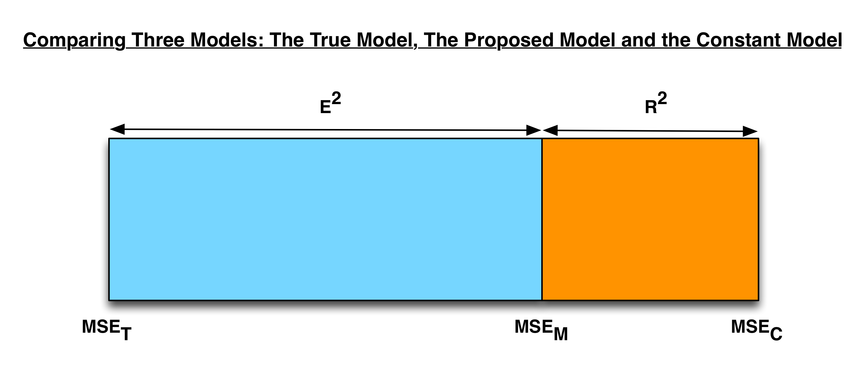
When measuring a model’s position on this spectrum, \(R^2\) and \(E^2\) are complementary quantities.
Retrospective Edits Round 3 Link to heading
An alternative presentation of these ideas would have focused on a bias/variance decompositions of the quantities being considered. From that perspective, we’d see that:
$$ R^2 = 1 - \frac{\text{MSE}_m}{\text{MSE}_c} = 1 - \frac{\text{bias}_m^2 + \sigma^2}{\text{bias}_c^2 + \sigma^2} $$Using the redefinition of \(E^2\) I mentioned in the first round of “Retrospective Edits”, the alternative to \(R^2\) would be:
$$ \begin{align*} E^2 &= \frac{\text{MSE}_m - \text{MSE}_t}{\text{MSE}_c - \text{MSE}_t} \\ & = \frac{(\text{bias}_m^2 + \sigma^2) - (\text{bias}_t^2 + \sigma^2)} {(\text{bias}_c^2 + \sigma^2) - (\text{bias}_t^2 + \sigma^2)} \\ & = \frac{\text{bias}_m^2 - \text{bias}_t^2}{\text{bias}_c^2 - \text{bias}_t^2} = \frac{\text{bias}_m^2 - 0}{\text{bias}_c^2 - 0} \\ &= \frac{\text{bias}_m^2}{\text{bias}_c^2} \\ \end{align*} $$In large part, I find \(R^2\) hard to reason about because of the presence of the \(\sigma^2\) term in the ratios shown above. \(E^2\) essentially removes that term, which I find useful for reasoning about the quality of a model’s fit to data.